Creative Direction & Brand Launch for Kin Euphorics
Full digital and creative direction for Kin Euphorics, the first functional beverage brand of its kind. Led UX, UI, art direction, and creative systems across brand, web, email, packaging, and experiential, transforming a nascent concept into a breakout cult success that redefined the beverage category.
Project Intro
In 2017, Kin Euphorics emerged as a bold newcomer in the nascent functional beverage space. With a foundational identity in place, the Kin team brought on a Creative Director to push the brand over the finish line by evolving the system, adapting it for digital, and building a cohesive, multi-touchpoint experience. What began as a website design project quickly expanded into a holistic creative partnership spanning brand evolution, content, packaging, events, and more. From the outset, the objective was not just to launch a site, but to define a new category and ignite a cultural movement.

design goals
Translate and expand the brand for digital platforms
Kin’s original identity was designed with print in mind and lacked the flexibility, visual hierarchy, and accessibility needed for digital environments. Core elements like typography, color contrast, and layout structure had to be reconsidered to work effectively across screens and devices. The goal was to thoughtfully evolve and expand the brand system so it could perform seamlessly and cohesively across every touchpoint, from web and email to packaging, social, and beyond.
Educate users on the product without losing the magic
The goal was to create a visual experience that felt rich, moody, and transportive, using dark palettes, unexpected color combinations, and esoteric imagery to spark curiosity. But because the product and its ingredients were unfamiliar to most users, the brand also needed to communicate clearly and confidently. The challenge was to strike the right balance by building a world that felt intriguing and culturally cool, while using plainspoken, functional language to explain exactly what Kin was and how it worked.
Disrupt a legacy category with a brand that feels anything but ordinary
We drew from the editorial worlds of fashion and fragrance to create a brand that felt elevated and visually distinct. Through full-flood color treatments, expressive type choices, and stylized photography, we built a rich visual language that stood apart from traditional beverage brands. By investing in original assets and treating every detail as a moment of storytelling, we crafted an experience that felt more like a luxury campaign than a wellness product.

Design Principles
Esoteric, not obscure
We created a rich, transportive visual world by leaning into mood, mystery, and ritual, using dark palettes, unexpected color combinations, and esoteric photography to build depth and intrigue. To balance that atmosphere, we paired the visuals with a clear, functional voice that helped users understand the ingredients, benefits, and purpose of the product. This contrast made the experience feel elevated and accessible, inviting curiosity while delivering clarity.
Maximalist in a minimalist era
We broke away from the minimalist playbook that defined early DTC brands, opting instead for bold contrast, dark velvet tones, wavy dividers, and surreal photography. This aesthetic felt fresh and unexpected, cutting through the visual noise of the category. The distinctiveness of the creative approach helped set Kin apart and contributed to a broader shift toward maximalist design across the wellness and beverage space.
Luxury-inspired, category-defining
We drew from the editorial worlds of fashion and fragrance to create a brand that felt elevated and visually distinct. Through full-flood color treatments, expressive type choices, and stylized photography, we built a rich visual language that stood apart from traditional beverage brands. By investing in original assets and treating every detail as a moment of storytelling, we crafted an experience that felt more like a luxury campaign than a wellness product.

Process
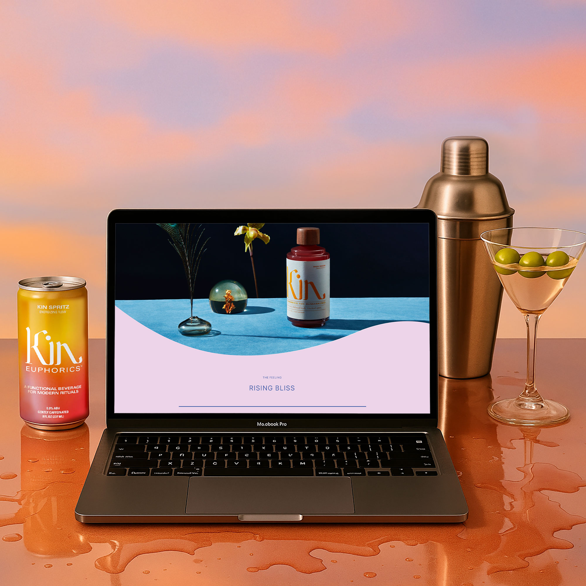
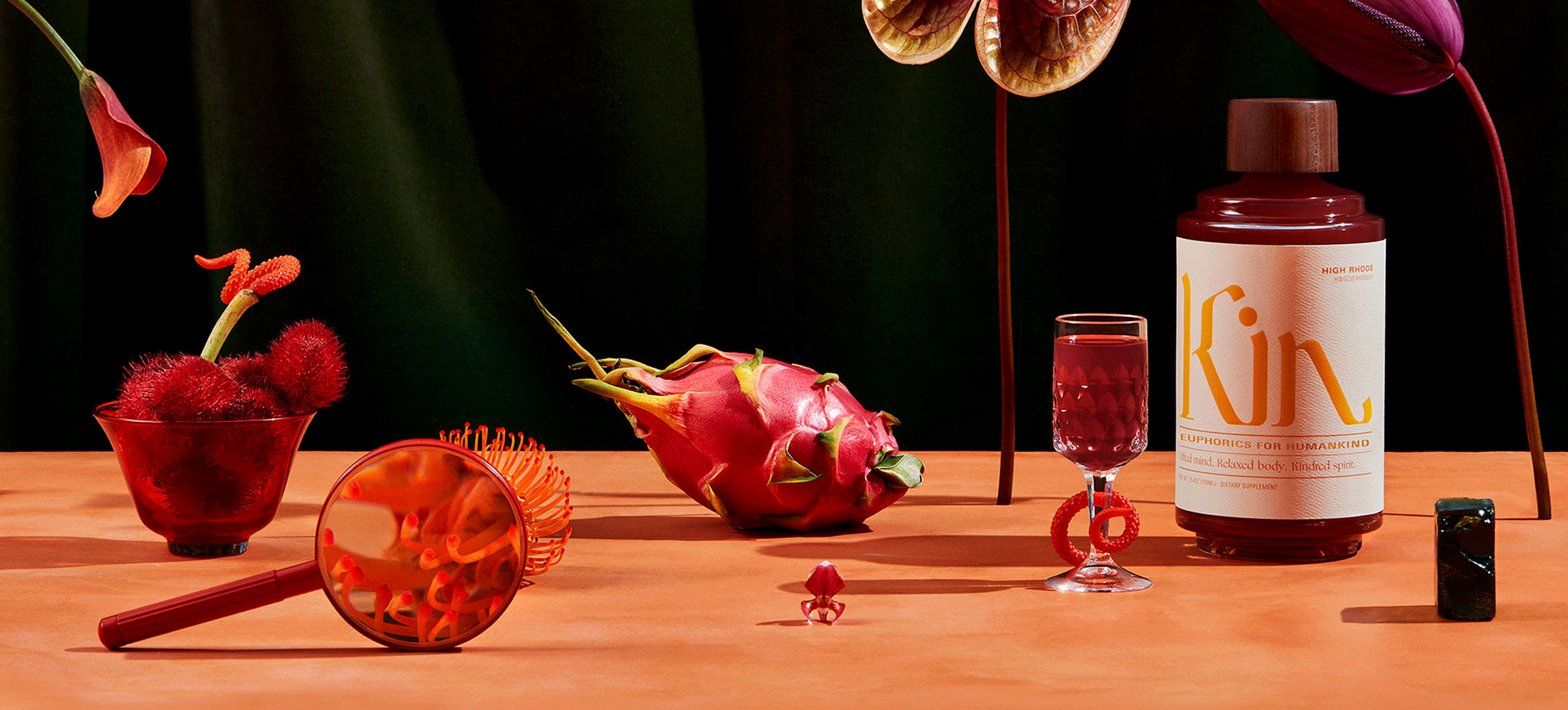
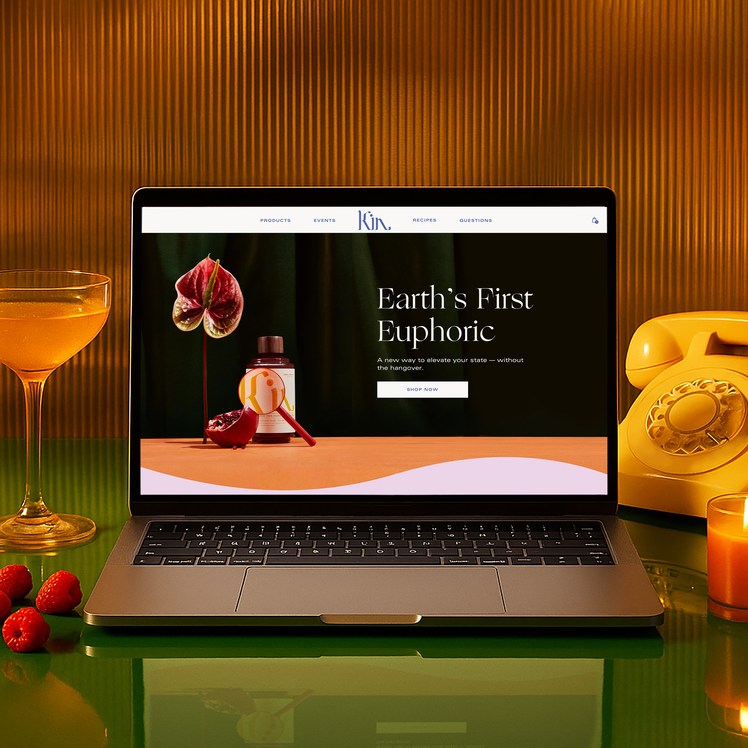
The process began with wireframes to define structure, hierarchy, and messaging across desktop and mobile. These helped clarify what needed to be said, where it should live, and how to guide users toward understanding the product. This was especially important given the complexity of Kin’s ingredients and benefits. Several rounds of iteration with the founder and core team refined the wireframes to balance clarity, flow, and storytelling. Once the foundation was in place, the project moved into high-fidelity design. As the visual work progressed, it became increasingly clear that the existing brand toolkit had not been built with digital execution in mind. A full audit of the inherited system revealed critical gaps in legibility, usability, and flexibility. Color combinations failed accessibility standards, headline treatments were too stylized for long-form content, and the photographic guidance provided was limited and disconnected. These limitations prompted a broader evolution of the system. Rather than discard the original identity, the goal was to build on what existed and expand it into something more functional, expressive, and digitally adaptable. A refined visual language was developed to build on the original identity, focused on accessibility, versatility, and a more expressive approach to storytelling. Updated typography scales, layout systems, and digital-friendly color palettes were introduced to ensure consistency across all touchpoints. Photography became a top priority. The original materials included only a limited set of visual references, which provided a starting point but left room to further define the brand’s direction. A full art direction framework was created, including moodboards, shot lists, and styling. Photographer Suzanne Saroff led a custom shoot styled with layered textures, velvet backdrops, and surreal floral elements. The resulting imagery brought richness and depth to the brand and was integrated directly into the site. The site launched under tight timing due to an unexpected Vogue feature, requiring an accelerated QA process to ensure design fidelity. We remained closely involved throughout development to maintain consistency and uphold quality. Following launch, the engagement expanded. Social templates, influencer kits, branded merchandise, and marketing assets extended the system across channels. A robust email ecosystem was created, with more than 20 templates spanning marketing, transactional, and waitlist flows. The waitlist experience in particular was carefully designed to build anticipation and manage demand with clarity and ease. As the product line grew, the site architecture was updated to support new SKUs and formats. Packaging was redesigned for a smaller bottle size based on customer feedback, with revised dielines, labels, and shipping materials. Event collateral was developed for Kin’s speakeasy-style happy hours and influencer dinners, including menus, coasters, signage, and immersive printed pieces. A limited-run influencer kit was produced and sent to a curated list of cultural tastemakers. Strategic off-sites and roadmap workshops brought internal and external teams together to shape the long-term creative vision and identify future brand opportunities.

challenges
One of the core challenges of this project was the balancing act between clarity and mystery. Kin was launching a new product in a new category, and very few consumers at the time were familiar with terms like nootropics or adaptogens. The brand needed to educate without becoming clinical, and inspire without confusing. Every image, word, and UI element had to do double duty: build intrigue while communicating function. The photography needed to feel surreal, yet not so abstract that it obscured the product. The copy had to be editorial and evocative, but still help people understand how Kin worked and when to drink it. This tension between clarity and cool required precise creative calibration and an ability to shift registers across content and context. On top of that, much of the inherited brand system was unfit for digital use, requiring swift reinvention on a compressed timeline. Development deadlines were further complicated by a high-profile press feature in Vogue that forced an early launch. Even post-launch, the demands were high as new features, SKUs, and touchpoints were introduced rapidly. The only way to meet this pace was to build a flexible, systematized creative foundation that could scale as the brand grew. This foundation became the throughline across all expressions of the brand.

Results
The Kin Euphorics launch generated immediate cultural momentum and helped establish a new visual and strategic language for functional beverages. The site stood out with its bold design, moody tone, and richly layered brand experience. In a sea of flat, pale pinks and Helvetica, Kin offered something entirely different: esoteric, stylish, and full of personality. The press response was explosive, community engagement was strong, and the brand quickly found itself at the center of the wellness-meets-nightlife conversation. Dozens of copycats followed, borrowing heavily from the aesthetic and tone developed in this early phase. Even as the brand evolved with new stakeholders and collaborators, the original creative direction laid the foundation for its lasting impact. This work positioned Kin not just as a product, but as a cultural statement that continues to influence the category years later.