
Full Brand Identity & Brand Launch for Andie Swim
Brand identity, UX, and creative direction for Andie Swim, developed in close collaboration with founder Melanie Travis from concept to launch. The work spanned research, brand development, packaging, photography, and digital design, laying the foundation for one of the most successful swimwear brands in the DTC space.

Project Intro
In 2016, founder Melanie Travis set out to build a new kind of swimwear brand and brought on design support at the earliest stage to help bring that vision to life. With no product, no visual identity, and no established audience, the challenge was to shape a brand that could meet an urgent and unmet need. Swimwear shopping felt broken. The category was dominated by brands emphasizing sex appeal over comfort, with little regard for diverse sizing, functional support, or body positivity. Andie set out to change that by creating a brand designed to make women feel confident, seen, and supported. Creative leadership was embedded early to translate that ethos into a visual and strategic system that could resonate deeply and scale quickly.

design goals
Build the brand from the ground up
Develop a comprehensive brand foundation including strategy, identity, and digital expression for a new DTC company with an ambitious and timely mission.
Differentiate in a saturated market
Create a distinctive visual and verbal identity to separate Andie from legacy players and signal a more thoughtful, inclusive approach to swimwear.
Design an immersive digital experience
Craft a website that prioritized education, storytelling, and conversion while addressing real pain points in the swimwear shopping experience.

Design Principles
Soft strength
The brand leaned into warm, skin-toned palettes, curvaceous typography, and intimate, textured visuals to counter the loud, hyper-feminine aesthetics of competitors.
Cheeky but grounded
Visual and tonal choices reflected Andie’s distinct personality: charismatic, confident, and emotionally intelligent without being overly saccharine or surface-level.
Made for women, by women
The entire system was built with the founding intention in mind: to create something genuinely supportive, beautiful, and real for women, by women.

Process
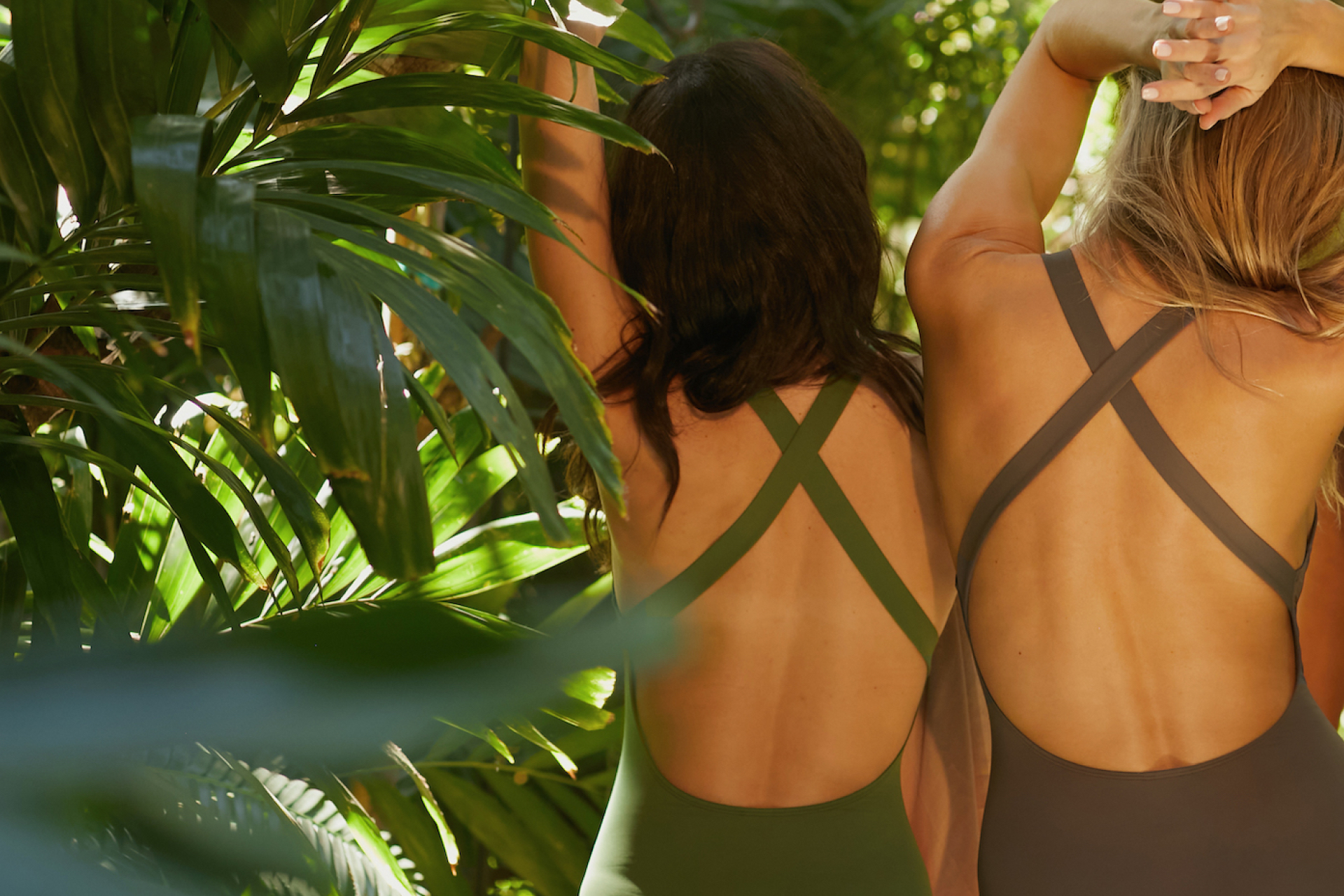
The engagement began with foundational strategy work, including a full market audit, competitive analysis, and persona development. The goal was to uncover whitespace across product design, messaging, and customer experience. One insight stood out: existing swimwear brands were failing to meet functional needs and weren’t addressing the emotional discomfort many women experienced when shopping for swimsuits. With the strategy in place, the next phase focused on the visual identity. A brand system was developed to convey warmth, confidence, and inclusivity. The wordmark featured bold, curvaceous letterforms with distinctive swirls on both the “A” and “D,” echoing the curves of the body and introducing a sense of movement and femininity. A secondary “A” in a circle was created for sewn-in tags and garment labeling. The color palette leaned into soft neutrals and skin tones to reflect comfort, approachability, and body-positivity. A comprehensive brand guide defined logo usage, typography, color, photography, and illustration styles. The third phase centered on digital design. The website was treated as both storefront and storytelling platform, with UX wireframes mapping out key flows, brand messaging, and interactive touchpoints. A custom fit quiz was developed to guide users toward swimsuits that matched their body type and preferences. Both desktop and mobile designs were refined through multiple iterations for clarity, speed, and ease of use. Visual design extended the brand into the digital environment using textural elements like stone, sand, and water to reflect tactility and intimacy. With the brand and site in place, attention turned to packaging, collateral, and photography. A system of early-stage packaging was created to support hands-on fulfillment, including branded hang tags, stickers, shipping tape, and lightweight poly bags. A photography strategy and shot list were developed to guide campaign production. Photographer Suzanne Saroff was brought in to capture the brand’s first imagery, with creative direction focused on composition, wardrobe, props, and tone. Development was led by Einar Aðalsteinsson, who worked closely with the creative team to ensure quality, responsiveness, and alignment across the final site launch.

challenges
With no internal team and limited startup resources, the project required a high degree of hands-on leadership, cross-disciplinary thinking, and strategic prioritization. Every decision had to deliver both creative integrity and practical value. The cultural moment also brought added urgency. Andie was launching during a pivotal time in American culture, shortly after the 2016 election, when women were reclaiming power and demanding more from the brands they supported. The brand needed to feel not only functional and fresh, but also emotionally resonant and culturally attuned.

Results
Andie launched to immediate traction. The brand’s identity and tone stood out in a crowded category, and the response was swift. Celebrities such as Mindy Kaling and Lena Dunham began wearing the suits, and a major campaign with Demi Moore followed. Andie scaled quickly, raised multiple rounds of funding, and expanded into new categories. The brand’s foundation, built on strategic insight, visual clarity, and emotional intelligence, helped position Andie as a modern icon in the DTC space and a powerful case study in designing with empathy and intention.


“Wildes District helped to build our brand from the ground up. They feel like a member of our core team and developed everything from our site, to our physical collateral to our entire brand development. They were a delight to work with: creative, thoughtful and thorough.”