
Full Brand Identity for Hiro Diapers
Full brand identity for a myco-degradable diaper startup founded by serial entrepreneur Miki Agrawal. The visual system blends subversive sustainability with expressive storytelling, offering a fresh take on parenting that breaks from category conventions.
Project Intro
Many baby and diaper brands lean into infantilized aesthetics that speak to children rather than the adults buying for them. Hiro needed to resonate with creative, thoughtful parents looking for something cooler. The brand had to feel natural but not hippie, playful but not babyish. It needed to be smart, stylish, and grounded.

design goals
Build a brand that parents respect
Many baby and diaper brands lean into infantilized aesthetics that speak to children rather than the adults buying for them. Hiro needed to resonate with creative, thoughtful parents looking for something cooler. The brand had to feel natural but not hippie, modern but not babyish. It needed to be smart, stylish, and grounded.
Translate radical science into visual storytelling
The mushroom compound at the core of Hiro’s innovation was complex and unfamiliar. The design had to make the science feel clear and trustworthy while staying visually compelling. Quick, clever visual cues were essential to explain the product without relying on dense text or technical language.
Create a crafted, tactile experience
From the diapers to the welcome kit and shipping materials, every moment with Hiro was treated as a thoughtful brand touchpoint. The design needed to feel cohesive, deeply tactile, and intentionally hand-rendered. It was a return to brands that feel made with care, not manufactured.
Design Principles
Confidently unconventional
The identity pushed beyond traditional category tropes to feel exciting, vibrant, and truly original. It rejected the expected mix of pastel palettes, soft curves, and saccharine copy in favor of bold color, graphic contrast, and a tone of voice with edge and wit. The goal was to signal from the first glance that this was something different, something smart, subversive, and culturally aware.
Letting the visuals do the talking
From the diapers to the welcome kit and shipping materials, every moment with Hiro was designed to tell the brand’s story without requiring explanation. Visuals carried the weight of communication through texture, illustration, material, and form, allowing parents to instantly understand the product and connect to its purpose. The goal was to build a brand that spoke clearly and emotionally through design alone.
Organic but not rustic
Photography, color, and typography emphasized imperfection, tactility, and a connection to the natural world, while still maintaining a sense of polish and restraint. The system was carefully constructed to feel thoughtful and elevated, with every detail considered for scalability, without ever veering into something that felt generic or mass-produced.

Process
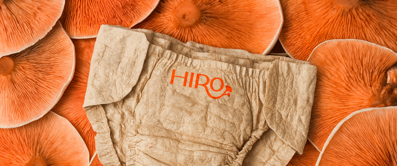
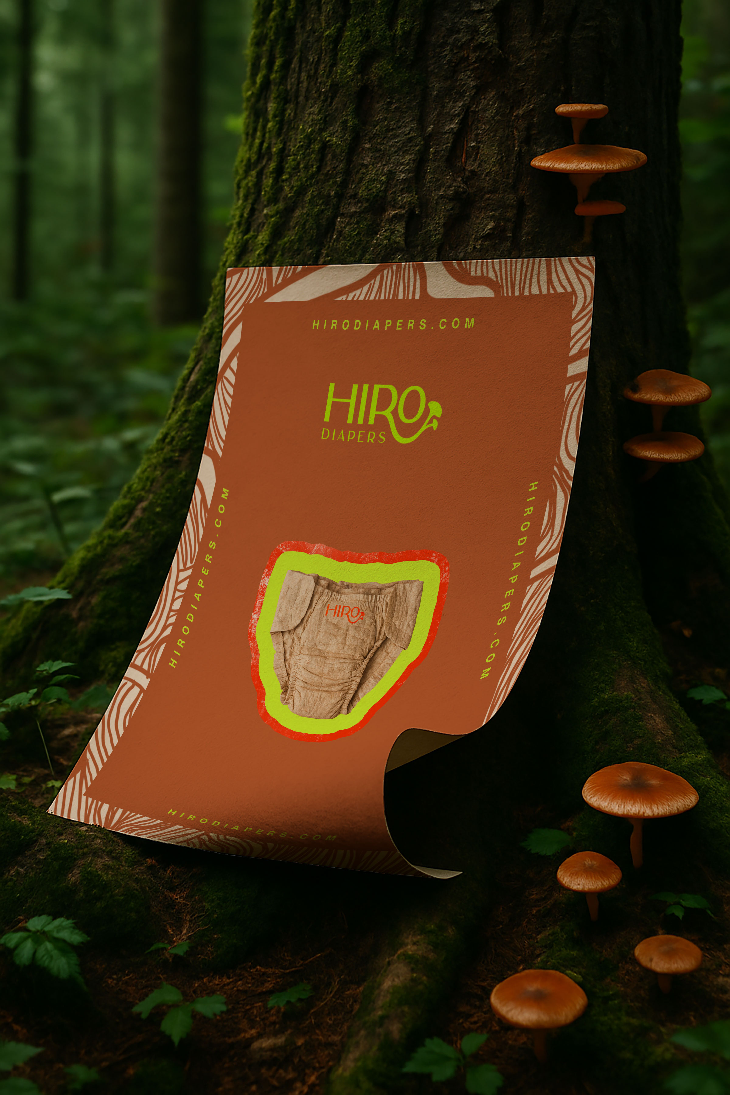
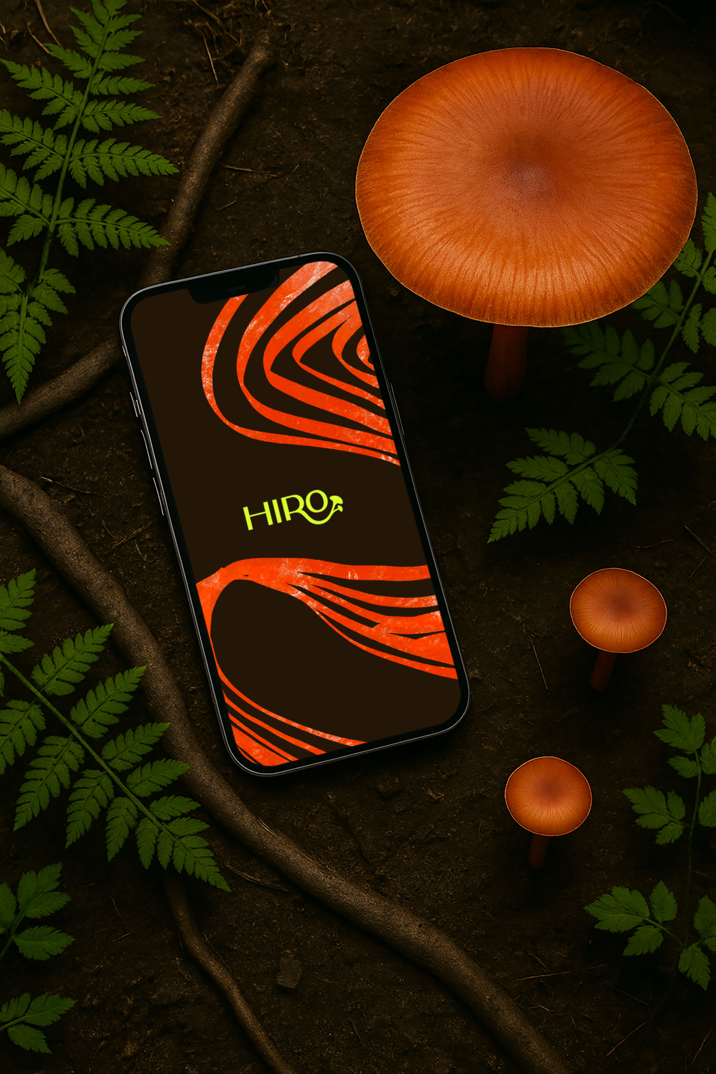
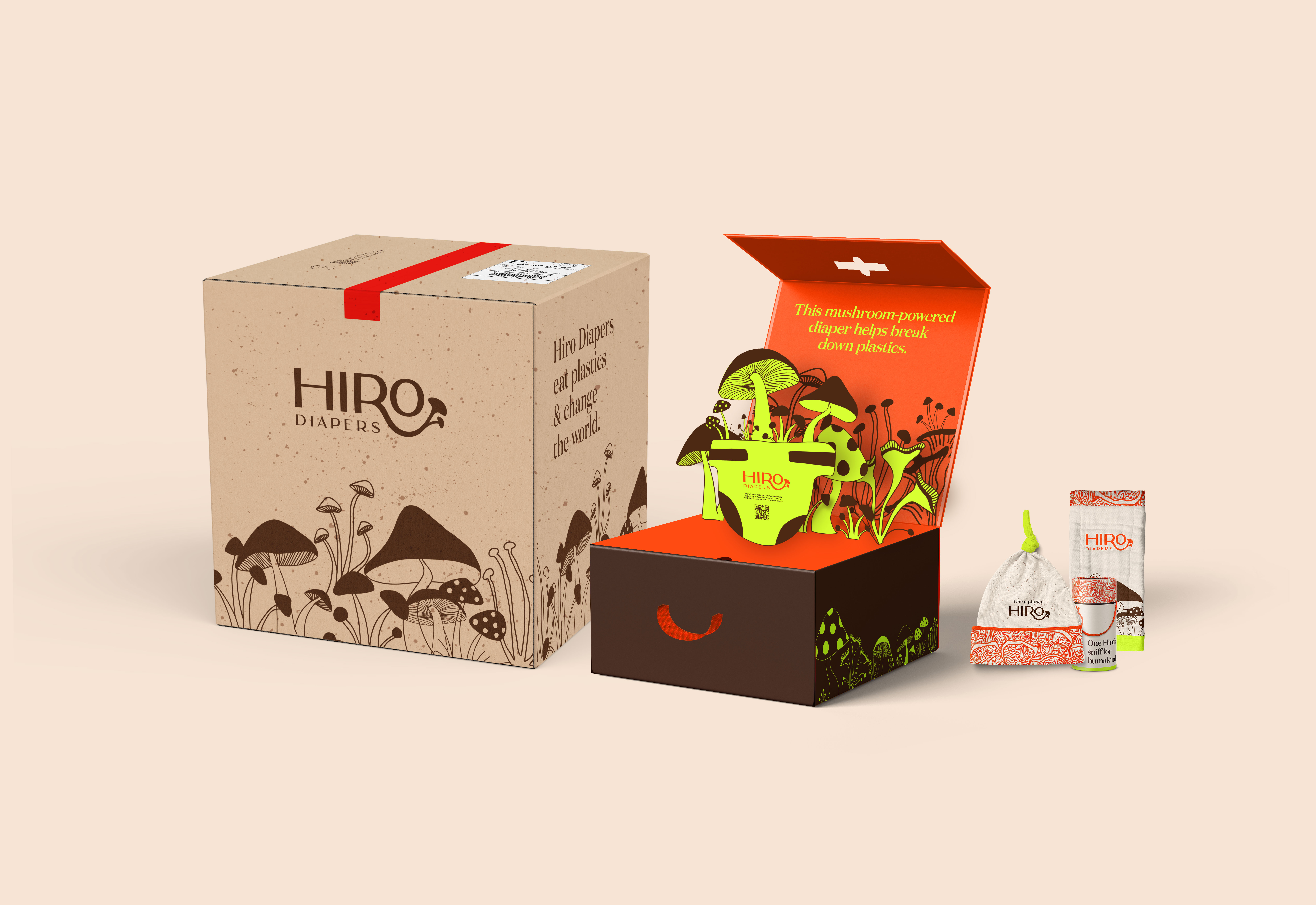
The engagement began with a comprehensive brand audit focused on both diaper-specific competitors and the broader children’s category. There was a clear gap in the space for a brand that felt grown-up, expressive, and modern. Dozens of visual directions were developed, each exploring a distinct tonal position. Concepts were mocked up across digital and print contexts early on to ensure performance across channels. Logo development prioritized legibility and personality, culminating in a wide sans-serif mark with a mushroom flourish extending from the R letterform. A neon red and chartreuse palette, supported by earthy neutrals, created a striking balance between boldness and naturalism. Photography direction was rooted in realism: expressive toddlers in motion, messy faces, barefoot curiosity, and minimal styling. Children were treated as protagonists in a larger visual story about freedom, dirt, and discovery. Illustration also played a central role in the brand system. Each icon was drawn by hand to bring warmth, irregularity, and an unmistakably human touch to the identity. These elements were then vectorized for consistency but retained their tactile, imperfect origins, creating a visual language that felt personal rather than mechanical. In a category often defined by plastic-feeling, computer-generated assets, this return to hand-rendered storytelling became a key differentiator. This crafted approach extended into the physical product. The diapers themselves presented production constraints, as most US facilities offered limited flexibility. For the diapers themselves, we collaborated closely with operations lead Eric Riccardi to understand material, regulatory, and manufacturing limitations, ultimately landing on a restrained but intentional design that celebrated the texture and fibers of the natural material. Additional work included structural packaging design for a giftable welcome kit. Concepts were developed in 3D, exploring custom die cuts, layered reveals, and imaginative formats. The kit included the diaper packs, a custom mushroom powder vessel, a “Hiro’s Journey” storybook, diaper wipes, a branded changing pad, and a baby hat. Everything from the shipping box to the tape and inner liner was designed to feel like an extension of the brand’s mission.

challenges
Creating a platform that felt both experimental and emotionally resonant required balancing design innovation with operational realism. Diaper manufacturing constraints meant the first product could not accommodate some of the more custom ideas. Materials had to meet safety regulations while supporting a premium brand feel. The design system also needed to convey the science behind the mushroom compound in a way that was clear, beautiful, and credible. This required thoughtful information hierarchy, storytelling, and strategic restraint. There was also a constant negotiation between visual polish and raw imperfection. The photography and illustration had to feel messy but intentional, which demanded a high degree of art direction and iteration.

Results
Hiro launched with a fully realized brand system that defied expectations for the diaper category. The work stood out for its clarity, originality, and depth, successfully introducing an unfamiliar product to market with beauty and confidence. The identity helped frame Hiro as a movement rather than just a product, and created a sense of participation for early adopters. The studio’s holistic approach to product, story, and brand touchpoints created a foundation for long-term growth, aligned with the brand’s ethos of experimentation, nature, and change.

"Caley went above and beyond to present to us unique brand ideas, colors, fonts, design styles, and typography for my new brand Hiro that we could pick and choose from and she was so collaborative and easy to work with. Her aesthetic is excellent, her professionalism yet approachable nature is so lovely to collaborate with and she had zero ego involved, which is a lot to say for creatives! And she hit all of her deadlines. I highly recommend her and will work with her again.”